CSS :before and :after

february 10, 2024 - css

The :before and :after pseudo-elements in CSS are used to insert content before and after the actual content of an element, respectively. They are often used to add decorative elements or generate additional content without modifying the HTML structure.

Syntax

selector:before { /* styles for the pseudo-element before the actual content */ } selector:after { /* styles for the pseudo-element after the actual content */ }

image domain

Advantages

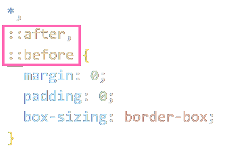
The :before and :after pseudo-elements in CSS provide several advantages, primarily related to their ability to insert additional content into the DOM without modifying the HTML structure. Here are some advantages:

Separation of Concerns

Using :before and :after allows you to keep presentational styles separate from the content structure. You can apply decorative or stylistic elements without cluttering the HTML with unnecessary tags.

No extra HTML Markup

You can achieve visual enhancements without the need for extra HTML elements. This can result in cleaner, more semantically meaningful HTML.

Styling for Decorative Content

Pseudo-elements are often used for decorative elements like icons, borders, or background images. This can be especially useful for adding visual flair to certain elements without affecting the document's semantic structure.

Content Generation

Pseudo-elements can be used to generate content dynamically, such as adding quotes, counters, or labels. This can be beneficial for styling elements based on their position or role within the layout.

Responsive Design

By using :before and :after, you can enhance the responsiveness of your design. You can insert additional elements or content based on media queries or other conditions, adapting the layout for different screen sizes.

Maintenance and Updates

Changes to styles applied with :before and :after are localized to the CSS, making it easier to update or modify the visual appearance of an element without altering the HTML structure.

image domain

Example in HTML

Here's an example where you can toggle between two different states using a switch. The :before and :after pseudo-elements will be used to represent the "on" and "off" states of the switch:

See the Pen Untitled by marcello (@tofjadesign) on CodePen.

image fireworks

The CSS part of this example.

                  
.switch { position: relative; display: inline-block; width: 60px; height: 34px; } .slider { position: absolute; cursor: pointer; top: 0; left: 0; right: 0; bottom: 0; background-color: red; border-radius: 34px; transition: .4s; } slider:.before { position:. absolute; content:. ''; height:. 26px; width:. 26px; left:. 4px; bottom:. 4px; background-color:. white; border-radius:. 50%; transition:. .4s; } input:checked + .slider { background-color: #2196F3; } input:checked + .slider:before { transform: translateX(26px); } input { opacity: 0; width: 0; height: 0; }
css

The switch is created using a combination of an "input" element and a "span" with the class "slider."

  • The :before pseudo-element is used to create a circular handle within the switch.
  • The :checked pseudo-class is used to apply styles when the switch is in the "on" state.
  • The transition property is used for a smooth transition effect.

You can toggle the switch by clicking on it, and the appearance will change based on the checked state of the input element. Customize the styles as needed for your specific design.

image domain